Shattered with Curve of Horn
by Max Miller Dowdle
Reviewed by Fes Works
First off, “artagem.com”? Not my first choice of URL for this comic, as there is nothing about the name of the comic remotely close to that URL. It’s possible there is a real/better URL that specifically goes to this comic, and “artagem.com” is a sort of hame base… but I was only given “artagem.com”.
As a general rule, I would recommend getting a more memorable URL, that actually somewhat reflects one’s comic.
Moving on.
The website is fairly simple at first load. Header, Menu, Comic, Background. The background is simple coloring with glass shattered. So it’s a nice and simple and effective background to remove dead space, without bring distracting. And thematic!
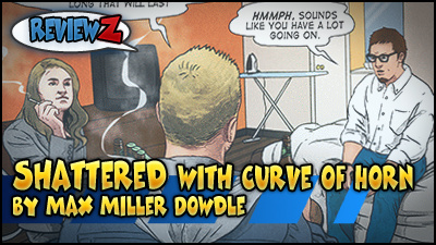
As of this review, the header shows the comic title with a shot of four characters, but also has a notice for a KickStarter, integrated into the header. And it really isn’t all that bad.
I mean… it looks like an ad, but being that there aren’t any other ads in this area, it’s not confusing enough, especially with the art in the header matching the art in the comic.
The comic updates are below a simple, no-nonsense menu (but really has everything a reader would need). Instead of a single comic page, the layout had two pages side-by-side.
I’m not 100% sure as to why the have two pages at once. I am sure some would argue that a single page would provide more space to make a bigger update in higher quality… But keep in mind that they are also doing a KickStarter at this time, too. Meaning that this creator wants to push a print comic.
I would take this set-up in giving readers a decent enough “preview” of the comic as it updates, without giving everything away (meaning high resolution material). I’m very fine with that. And I’m not saying the images are low-res, pre-se, You can still easily read it. Plus you get two pages per update.
Below the comic is the site blog and the bulk of the “other stuff”. But it is fairly modest, really. I’m not seeing any ads, whatsoever. Very rare not to see ads, especially with the level of quality in the comic (of which I’ll get to in a minute).
The left sidebar has a link to read the comic from the beginning, which is a good reminder for new readers that come to a storyline webcomic. Also links to get the RSS feed, and a vote button for TopWebComics (but there is no vote incentive, so I was a little disapointed).
– – –
For those that don’t know TopWebComics, its a webcomic listing site, that is designed to also rank comics based on readers “voting”. This website also allows creators to offer extra “incentives” for voting, such as wallpapers, pin-ups, sketches, or other related material to the comic; in which only voters would be able to see.
– – –
The right sidebar has a KickStarter embed, which makes perfect sense to have. Also drop-down links to pages in the archive. Blog updates are in the middle. Simple and not too cluttered, but it does get a bit visually boring. I wish the creator had set the background image to be “fixed” or something. The extreme whiteness makes everything feel less interesting, but existing readers probably have no problems with it.
OK! Now on to the comic itself!
At the time of review, the comic is just shy of 100 pages. I actually started at about page 90. The art itself is real decent. Everything is drawn in a more realistic design. Proper human anatomy, with very specific lines on the face, arms, etc. But it’s not stiff. There is a real sense of the artist knowing what he is doing. That or perhaps the feeling that the artist make be drawing from people posing in various positions, or using other referential material.
There are occasions in which the drawings feel a little “off” with perspective, and the amount of lines used (on the face in particular). The reason it probably feeling more “off” is in the coloring. I mean, the coloring isn’t flat, by any means. There are textures used all the time, too.
Well, possibly not textures… it’s hard to tell because the amount of shading is very subtle. It’s not stark shadows and highlights (which you would find more in cartoony coloring), but it is very subtle untill you really start looking. Probably would look a lot better in a high-res image, or possibly in print, where you could get a better sense of the coloring detail.
Though I worry about the darker shadows showing up as muddy. Meaning it looks like “shadow” means “add black or gray”, versus actually changing the color itself. But I’m starting to nit-pick, I think.
In any case, it’s really not bad art at all, at least for the characters. The background is more or less an assortment of shapes and colors, at least for outdoor scenes. The indoor scenes have more definition, and some added color and fades for helping to give a mood for a panel… no wait.. I think this room (a primary location for the first 100 pages) has two different colors, and the creator is shifting angles to affect the mood with the natural background color… clever.
Ok, now on to the story and writing.
The comic begins more on a sureal note, but it turns out that one of the characters is describing a dream. Then for the longest time it progresses as almost a play. A drama almost, in a single room. People who like character driven plot would probably get into this a fair amount.
Though I am starting to see another benefit of the two-page update method: It would kinda drag along if it didn’t update like that. There is a lot of build up, mood and emotion dressing in actions and reactions. The way the comic is written and played out, feels more like a screenplay for a TV show, really.
Without spoiling things, it starts to turn into a little more like the first half of an “X-Files” episode.
So, while the comic starts with a seemingly simple drama scenerio, it does start to pepper things up (especially with what I know is coming much later). Yeah, this comic is more of a graphic novel set-up than that of “comic book” periodical. Meaning that it’s more of a “sit a read”, than a “flip-through”.
Overall, this comic is looking very promising. I recommend for people hungry for more drama and storylines, particularly with a focus on character building driving the reader’s engagement.
[…] http://www.webcastbeacon.com/webcomic-beacon-review-shattered-curve-horn-max-miller-dowdle/ (A kinda funny review of Shattered) […]